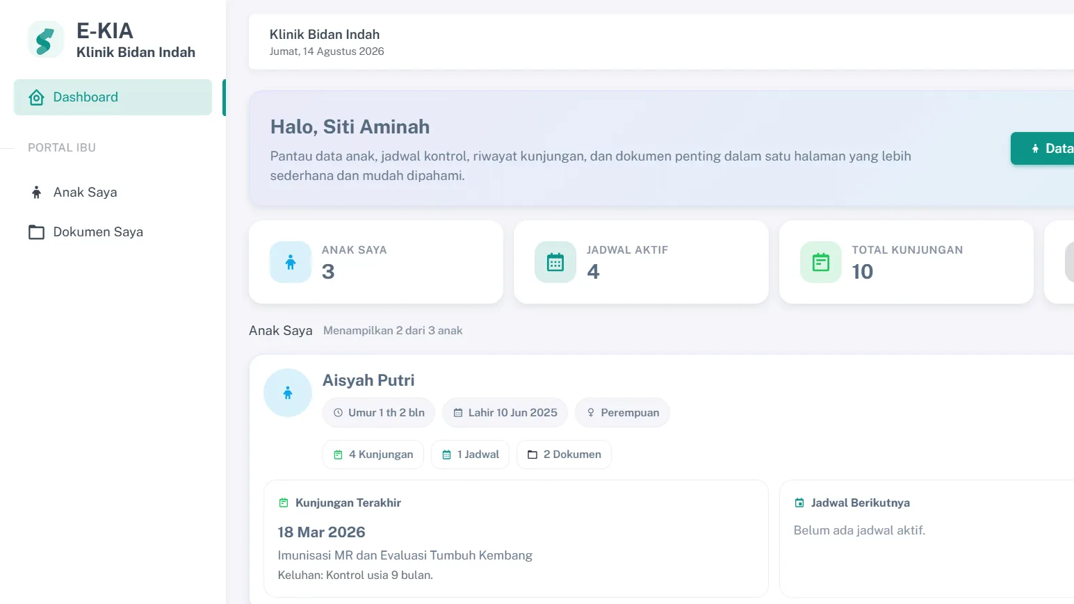
When an application has several roles, the first question is often which menus appear for administrators, staff, or management. Menus are necessary, but they are the end result. If the design starts from menus, permissions tend to follow the screens rather than the responsibilities.
In several applications I have worked on, I start from tasks instead. Who records the data? Who reviews it? Who makes the decision, and who only needs to see the result? The answers to those questions then decide the menus and permissions.
Roles follow responsibility
The maternal and child health records portal has four areas: administrators, staff, management, and parents or guardians. Staff record visits, growth, immunizations, and follow-up schedules on the child profile. Management reads dashboards and reports. Guardians can only open their own child's data.
All four look at information about the same child, but for different purposes. That is why their workspaces are separated from the start instead of being told apart by hiding a few buttons.
Viewing and changing are different permissions
Many roles only need to read data. Management in the KIA portal and the blood donor app needs dashboards and reports, but does not need to change daily transactions. Staff, on the other hand, need to record and update data within their own tasks.
Separating the right to read from the right to change makes mistakes less likely. Someone who only needs a summary does not hold a button that can change stock or a care history.
Other people's data stays closed
In the sweet potato CRM, several farmers sell through the same application. Each farmer manages their own products and promotions and only sees orders for their own products. The administrator holds the cross-account view.
The same principle applies to documents. KIA documents are stored privately and only appear in the guardian portal after staff verify them. Limits like these need to be enforced by the application when data is fetched, not only by menus that are left out.
Staged approval needs clear statuses
Some workflows involve more than one reviewer. In SIMYUT, department staff review each student's details and documents before the application moves to the faculty for the final decision. Students can see their application status at every stage.
In the blood donor app, volunteers do not get in right after registering either. Their email and an administrator's approval are checked first. Clear statuses let everyone see whose action an application is waiting for.
Menus are the result, not the starting point
Once the tasks and permissions are clear, arranging the menus becomes the easiest part. Each role gets pages that match its work, and no menu appears simply because it happened to be available.
Examples of these role splits are in the case studies for the KIA portal, the blood donor system, and SIMYUT.